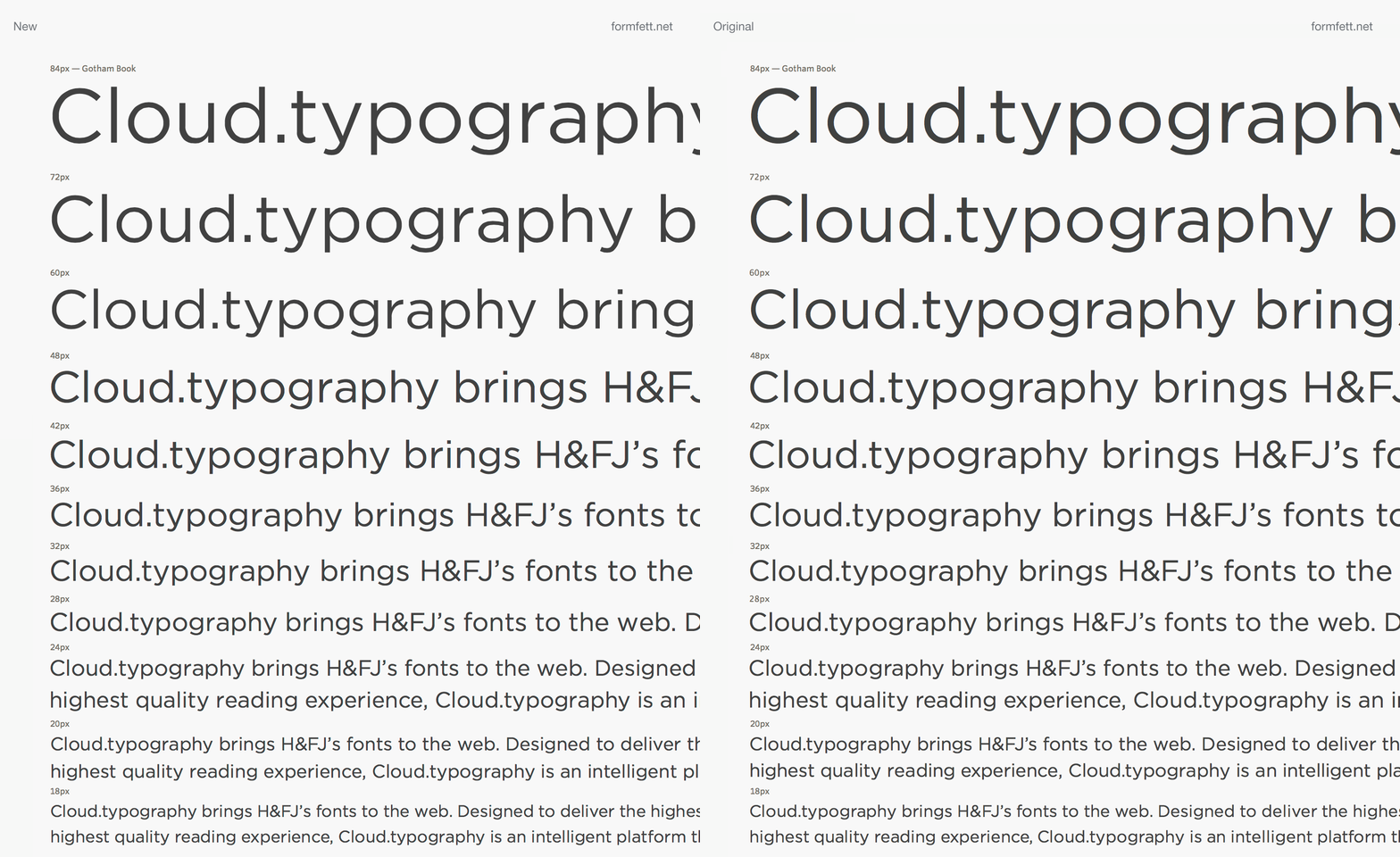
Hoefler & Frere-Jones have after many years finally released their fonts for use on the web. Did they spend to many years tuning their fonts for old school screens, making them look really bad on screens with high pixel density (retina)? I made a gif comparing the original font with the new web-optimized font with jagged curves. These are both screenshoots from OSX, Safari.
Update:
According to H&FJ the jagged lines seems to be a (Safari/OSX/iOS) problem occurring when fonts are converted into webfonts – which is basically a collection of flat segments. This could be solved by letting people host font files on their own servers. But font foundries seems to be more concerned with piracy, than how their fonts actually looks online.
I’m hoping we don’t have to wait another 5-10 years before we can use the amazing H&FJ fonts on the web.
Apple; will you please update your rendering engine so that it renders webfonts just as smooth as any other font?


Recent Comments