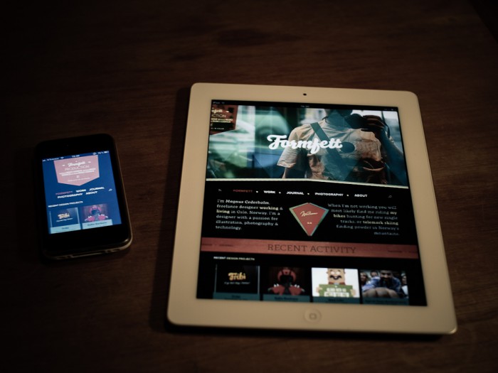
My redesigned portfolio is finally online. It’s still based on wordpress and it’s designed and coded by myself, with a little help from my friends. If you find any bugs, please be kind and write me a comment below. I have used Media Queries for a better iPhone and iPad experience.
Thinking about removing the Google Plus button. It takes forever to load and the service is just another buzz?
The site might not look all that good in Explorer, or on Windows in general, due to it’s horrible font rendering.
Congratulations! :)
Thanks! The relaunch was a little past due, more or less 4 years :-)
Sick design dude! Very well done.
Thank you Owen!
Looks lovely honey!
Hey, really nice site, congrats. Just spotted that there is a slight underline on the links in your lightbox. I’m using chrome on os x, but I’m guessing it’s on a few other browsers as well.
Great site. Excusing the windows/explorer font issues. IE should be wiped out forever!
Sweet redesign. I enjoy it!
Nice design. But found a bug. Searched for something that doesn’t exist. The footer is then not displaying correctly.
The red piece in the upper left hand corner gets cut off when iPad is in portrait.